Client: Slik Beauty
Industry: Beauty & Aesthetic Clinic
Service: Logo Redesign & Brand Identity
The Problem
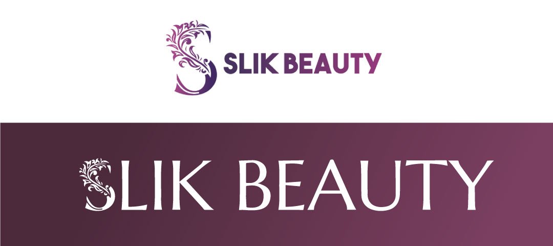
A beauty brand’s logo is often the first signal of the experience it promises. Slik Beauty’s original mark had a strong identity — but its heavy ornamentation and bold, playful typography were sending the wrong signal for a premium aesthetic clinic.
Before:
- Decorative and traditional styling
- Bold & playful typography
- Limited flexibility across digital platforms, packaging, and premium branding applications
The Challenge
The original logo lacked the refined aesthetic expected of a modern beauty brand. Its ornamentation limited versatility, holding the brand back from premium positioning.
The Solution
Rather than replace the identity entirely, the iconic “S” monogram was simplified and re-expressed — introducing elegant serif typography and refined ornamental detail to shift the mark from decorative to minimal-yet-luxurious.
After:
- Minimal yet luxurious
- Timeless serif typography
- Balanced composition
- Premium beauty positioning
Brand Symbolism
The signature “S” remains the heart of the identity, preserving brand recognition while evolving into a more refined expression — one built around sophistication, self-confidence, signature elegance, natural beauty, feminine grace, self-care, timeless beauty, and professional credibility.
Color Strategy
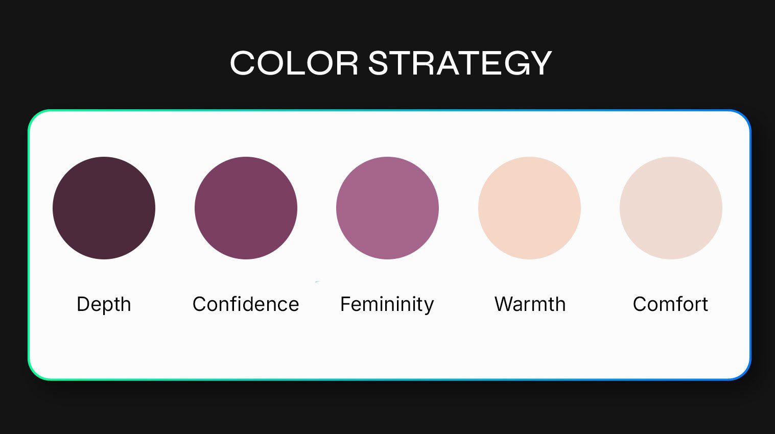
The palette blends warm neutrals with rich plum tones for a luxurious, emotionally engaging identity:
- Espresso Plum — depth
- Soft Mauve — femininity
- Champagne Beige — comfort
- Rich Plum — confidence
- Warm Nude — warmth
The Result
The refreshed identity establishes a stronger emotional connection with clients, supports future marketing efforts, and positions the brand for long-term growth in an increasingly competitive beauty and aesthetic industry.