Client: Nourishing Little Minds
Industry: Education
Service: Logo Redesign & Brand Architecture
The Problem
A brand outgrows its logo the moment that logo stops representing what it actually does. Nourishing Little Minds had expanded from a single retail store into a full educational ecosystem but its identity was still speaking in shopping bags.
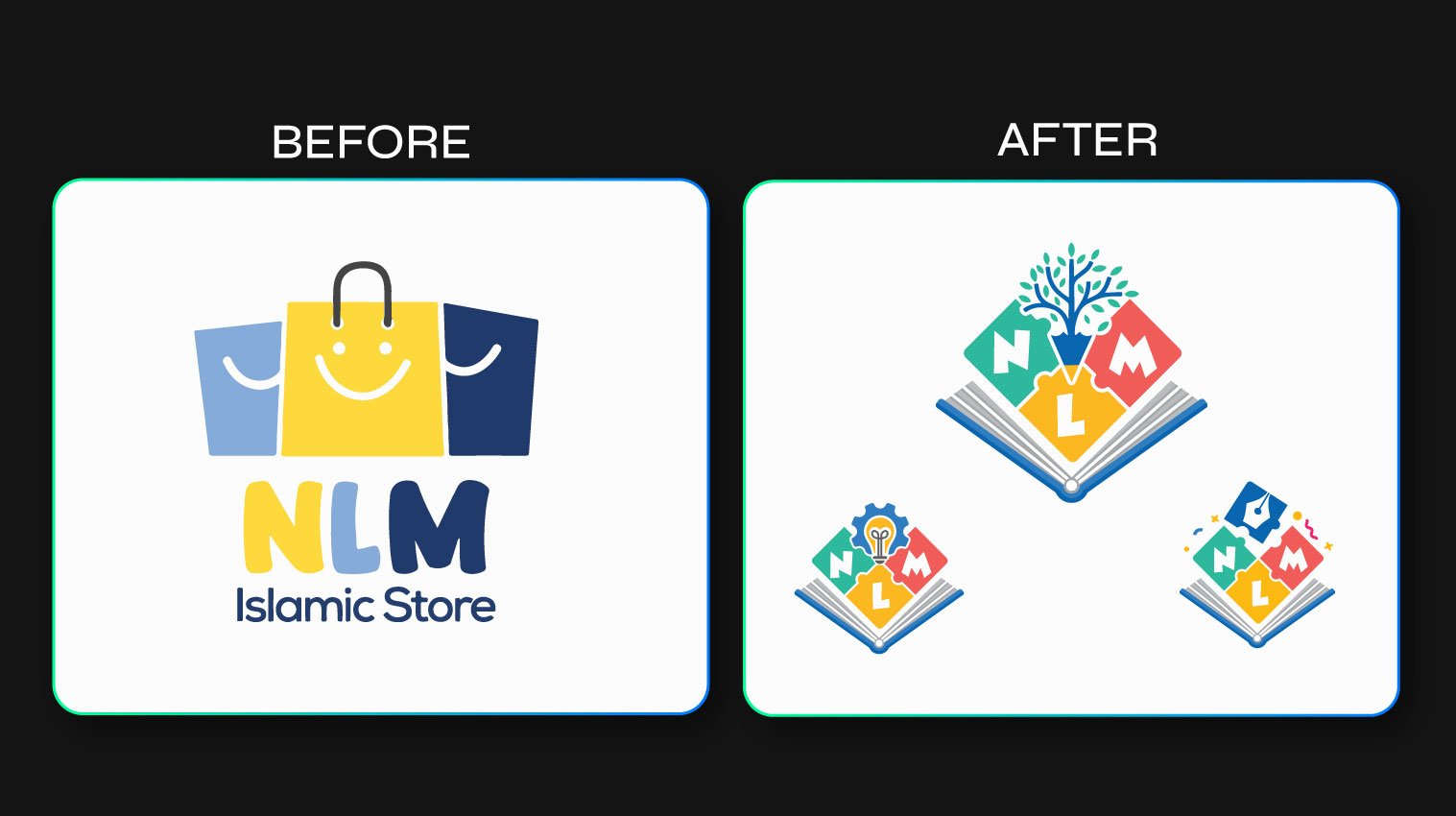
Before:
- Retail-focused visual language
- Limited scalability across new initiatives
- Brand fragmentation between the parent brand and its growing sub-brands

The Challenge
Create a logo system that reflected Islamic education, creativity, and child development — while giving each sub-brand room to keep its own purpose and personality intact.
The Solution
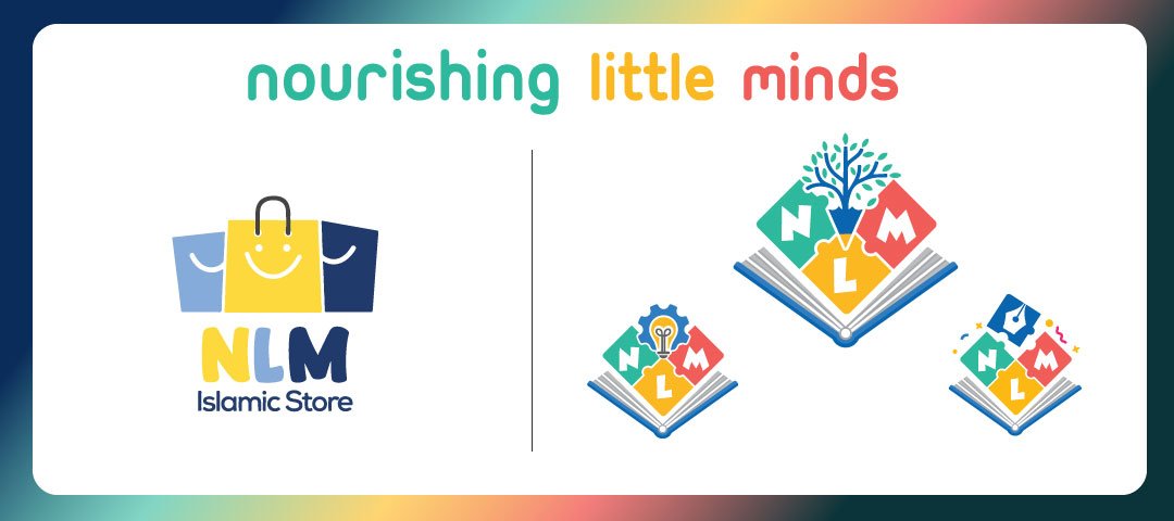
The shopping bags were retired. In their place: an open book paired with an interconnected “NLM” monogram, built to symbolize knowledge, learning, and growth at every scale.
The new system was designed as a parent brand with modular sub-brand extensions, not a single fixed logo:
- Parent Brand — Nourishing Little Minds: the open book and NLM monogram anchor the whole ecosystem, with a growing tree symbolizing intellectual growth, spiritual development, and roots in Islamic values.
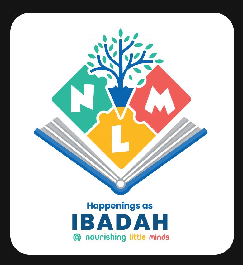
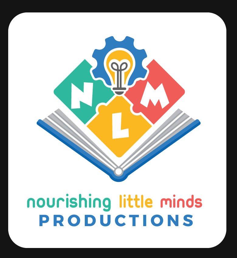
- Nourishing Little Minds Productions: the creative media and content arm, marked with a lightbulb motif for creativity, storytelling, and production.
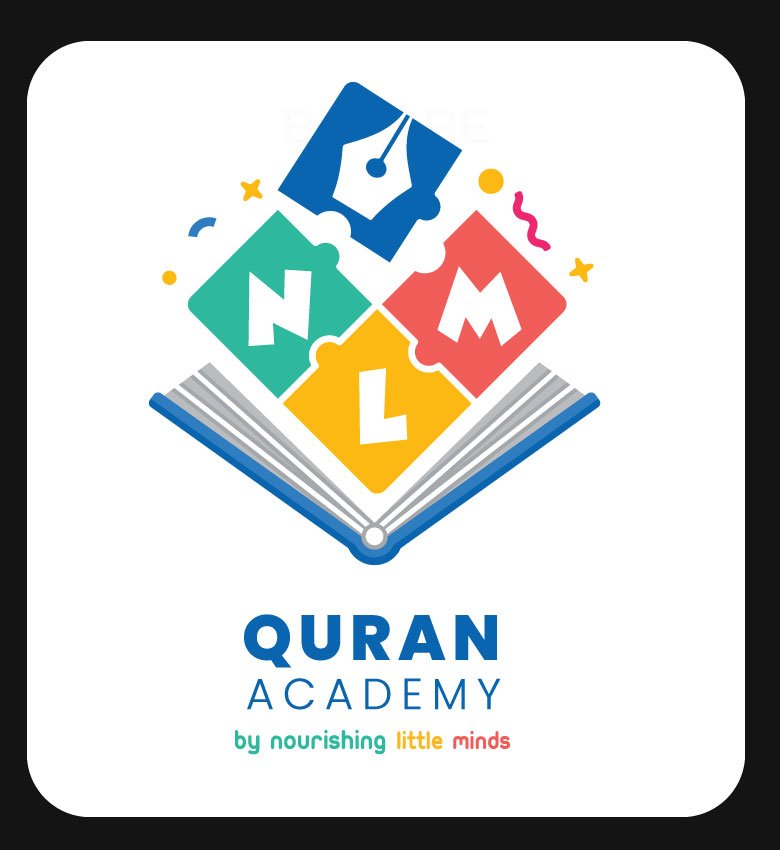
- Quran Academy by Nourishing Little Minds: a dedicated platform for Quran education and Tajweed, marked with a pen motif for academic excellence and structured learning.
Color Strategy
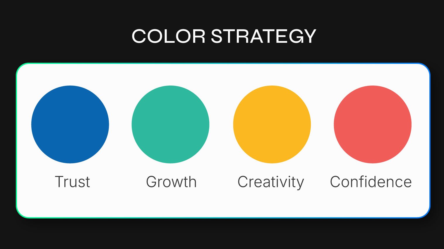
Every color in the palette was chosen deliberately: blue for trust, green for growth, yellow for creativity, and coral red for confidence — a palette built to feel warm and educational rather than corporate.
The Result
- A stronger, more recognizable brand identity
- A modular architecture that scales cleanly as new sub-brands are added
- A unified visual family — one symbolic language, multiple purposes, zero fragmentation